Coruña Próxima
Coruña Próxima is the brand behind the policies approved by the local administration of A Coruña for the second half of the term 2015—2019. A signature that will be present in every communication, coexisting with other initiatives and the city council identity itself.
We were inspired by the polysemy of the galician word 'próxima', meaning 'close, near', but also 'next'. The future A Coruña, built from the proximity with its citizens. That's why we chose the minimal icon of the vector arrow. A direction and evolution symbol.
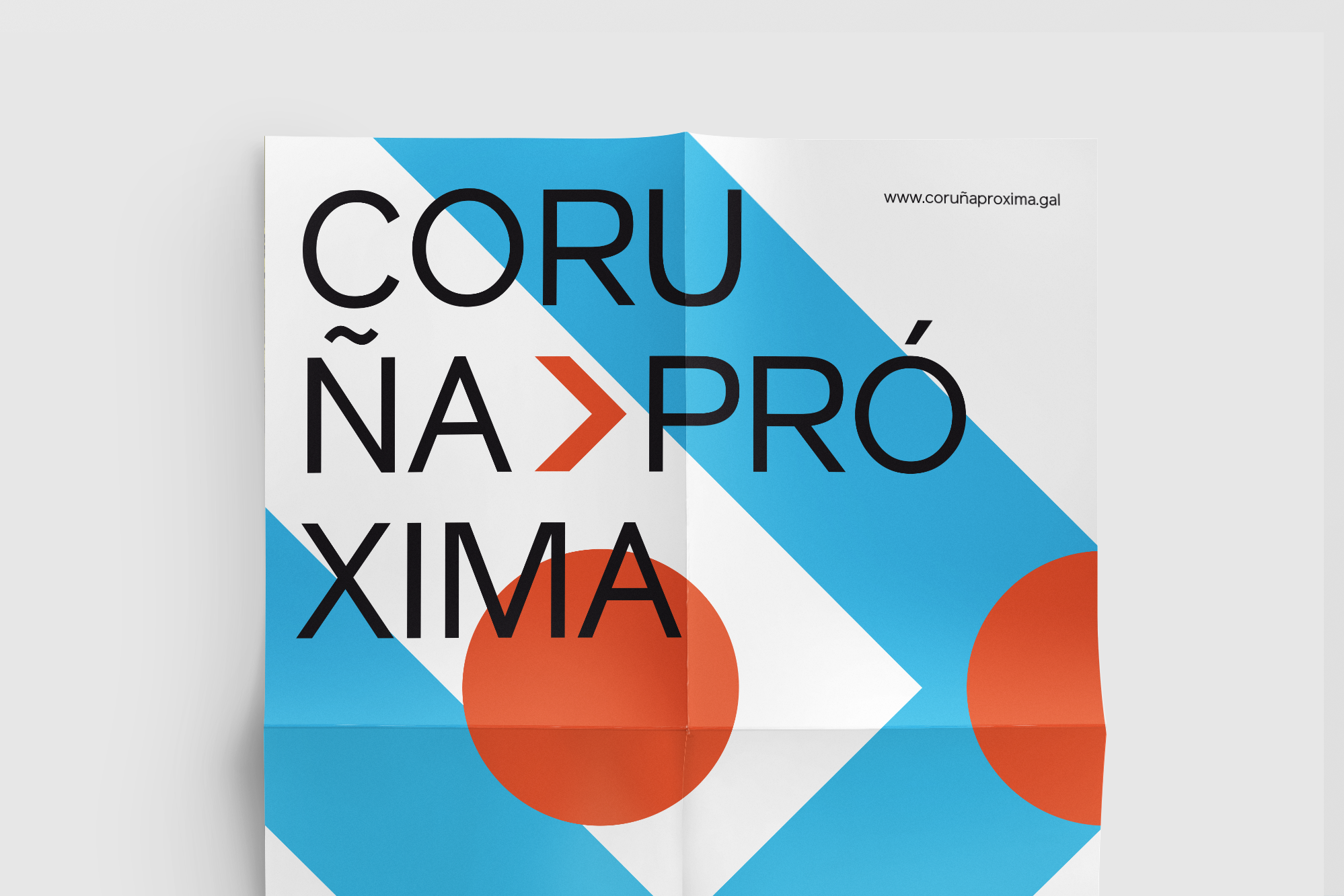
We designed a minimal but 'mutant' identity, with very open-minded guidelines and alternatives that should help an easy conceptual implantation in every format. We also created a 45 degrees grid based on the logo that we used to develop the specific materials for the project presentation.